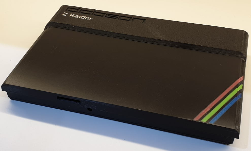
I have never owned a Sinclair ZX Spectrum but my best friend at university had one and I remember working away into the night on one occasion programming a Newton’s Cradle simulation as precisely as I could with the limited processing power available. I don’t recall it being hugely impressive and I’ve always admired the way games developers of the era (and amazingly even now it seems) have managed to eek out the maximum from that primitive machine. I also admire the aesthetic of the ZX Spectrum case as a fine example of product design. I also noticed this Kickstarter project which is the innards of an updated Spectrum minus case – so maybe this is a marriage made in heaven!
This post is about creating a 3D printed ZX Spectrum-Style case and if you just want to do that (as opposed to reading about the issues I overcame to print it) then jump to the Create Your Own section near the end. The files are available here: https://github.com/robdobsn/ZX-Spectrum-Style-Computer-Case
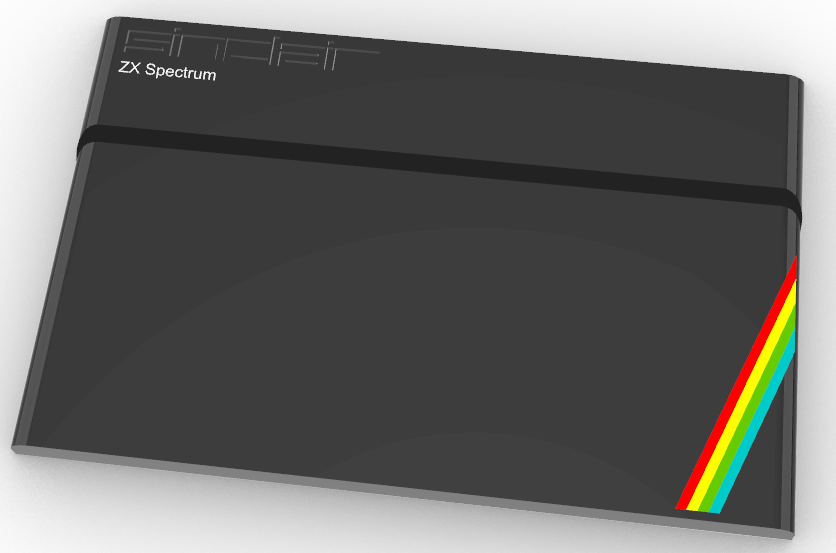
Since my BusRaider and Z-Raider projects have the ability to emulate ZX Spectrum games I decided that it would be nice to house my new Z-Raider computer board in a ZX Spectrum-Style case – so I started work on a design that could be 3D printed on a Prusa i3 with multi-material upgrade or similar FDM (melted-plastic-squirting) printer.
As it turns out a Prusa i3’s maximum advertised print size is 250 x 210 x 210 mm and the Spectrum was 233 x 144 x 30 mm. So obviously no issue height-wise but the width is pretty close to the max size and my printer mysteriously seems to hit a limit a little before 245mm on the X axis so I knew things might be quite tight.
First Base
It rarely takes me less than around four or five attempts to create anything reasonably complex for 3D printing (even though I’ve been working with 3D printers – and have designed one – for quite a few years now). I think the main reason for that rests with me rather than any hardware or software issues – I always want to push the boundaries and try out something new and generally that results in a whole bunch of failures before I get anywhere good.
For this project I was fortunate to find a model on 3dWarehouse which gave me a good idea of the outline of the ZX Spectrum – so thanks to CommodoreCheetah for sharing that. I extracted a wireframe from that model and used some of the lines as the template to get me started on a case. I haven’t followed it slavishly – I changed quite a few things to make it work for my purposes – but the result still looks (to my eye at least) like a ZX Spectrum case.
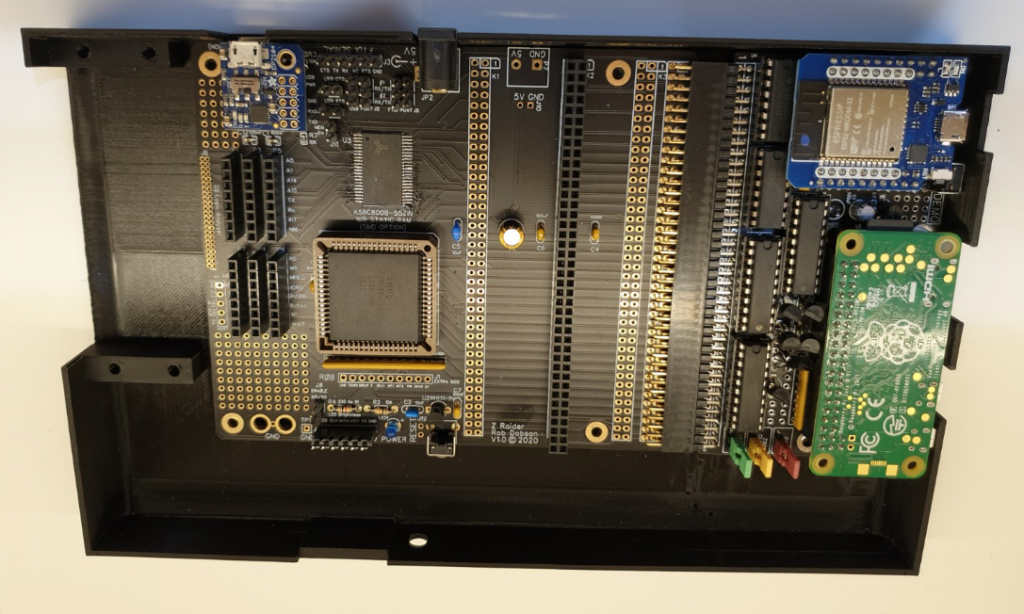
The first step I took was to create a relatively simple rectangular base of about the right size for the bottom part of a ZX Spectrum. I was less concerned about remaining too faithful to the original case and more interested in making sure my boards fitted correctly – there are two boards side-by-side in the full Z-Raider computer. And I decided to print the base at this point so that I could make sure everthing would fit inside and that it would be possible to design a top-part which looked like a ZX Spectrum and would fit the base.
Tricky Curves
So far so good, but when I started to build the top part of the case I realised it was quite a complex shape. The original design has a curved metal piece which frames the keyboard and wraps around the sides of the plastic case. This allows the higher rear part of the case to run seamlessly into the keyboard with a metal-to-plastic line creating a seam. I thought about creating the top part of the case in two pieces – the high-part which has the Spectrum logo on it and the keyboard part – but I couldn’t imagine how to connect them together and I thought that the line between the two parts would be really obvious and, hence, detrimental. So I decided to press on with an all-plastic single-piece version.
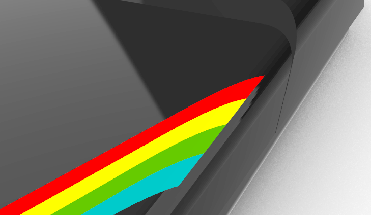
I also toyed with the idea of having a dummy keyboard – I really didn’t want a sponge one – but it looked like quite a lot of effort and when I’d done a rendered mock-up with a sheer surface and the spectrum coloured lines I decided that it looked pretty good like that.
Which Way Is Up
Now a very common question – which anyone familiar with designing for 3D printing will know all about – arose: which way up would I print the part. If I printed it upside down then the high-part of the case could touch the print-bed and this would allow it to have a nice texture (see later) but the keyboard section (which is several mm lower than the rear) would need to be printed with supports and this never leaves a very satisfactory finish in my experience.
So I decided to try printing the whole thing floating on supports (apart from some built-in pillars to allow the base to be attached to the top) and rely on the printer to create a good top-surface finish – possibly using the new ironing feature in the Prusa Slicer.

First Design
I should mention that my go-to 3D CAD is Rhino 3D which I’ve been using for 8 or so years since I was introduced to it by my friend Euan Lind (the designer of STEMZ). This is often both a blessing and a curse for projects like this. Rhino is extremely good at handling curves and more organic shapes so the complex 3D curves in the case were no problem – but it isn’t so good for trial-and-error redesign as (without using Grasshopper – which I’ve never become sufficiently familiar with to use) there is no parametric support so a small change can knock-on to myriad side effects and, if you try to cut corners as I often do, you can end up with 3D structures that shouldn’t really exist – things with inverted faces or naked edges – which make life a bit of a pain.
One thing I wanted to try out was putting a texture on the rear section as the original case has a shot-blasted mould appearance. In Rhino this can be done by applying a bump-map to the object but I’d never tried to print such a thing so I made a whole series of small patches and printed away for a few hours to find something workable. I chose the best option (which was more like a pan scrubber texture than I really wanted!) and designed that into the model.
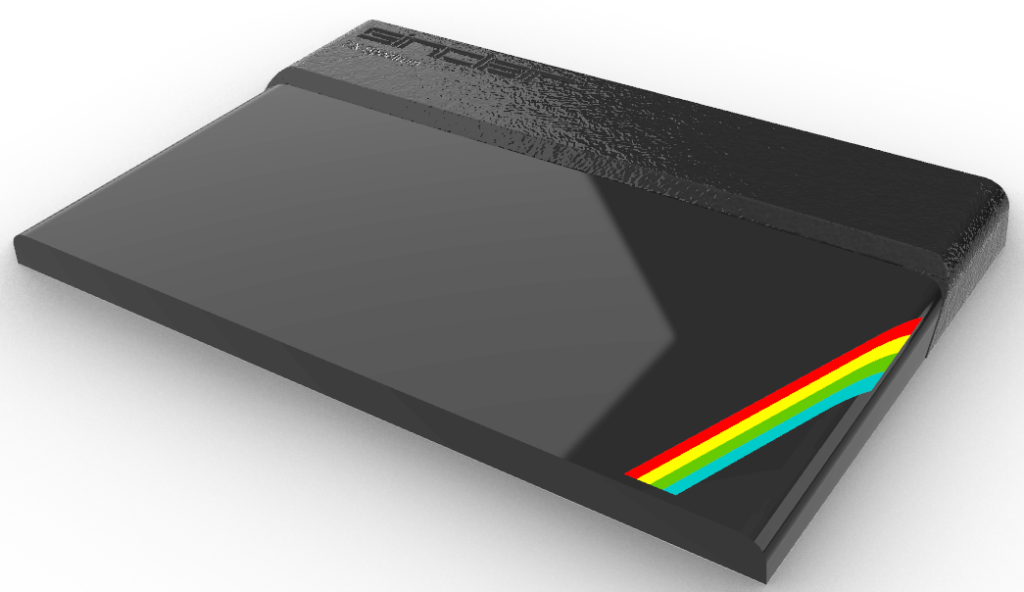
First Prints
Anyhow, eventually – after about twice as long as I had expected the whole project to take – never was that good at estimating 🙂 – I got to a point where I could print the top part of the case.
At this point I realised that I didn’t have enough of the Prusament filament that I find works well with the Prusa printer so I turned to another brand – which has generally worked ok – and started printing. Several (3 maybe) failed prints later I eventually managed to get the filament to adheer to enough of the 244 x 150 mm (the outline of the case with additional support material brim) area to complete a print – and the print time for this monster project (with ironing setting turned on) was a maddening 22.5 hours.
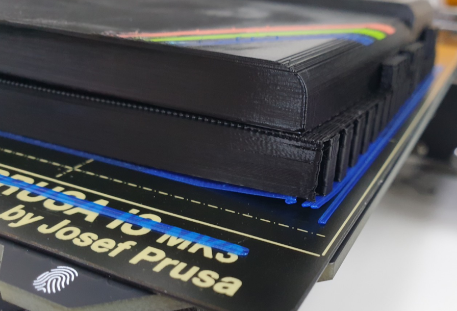
A day later I came to look at the outcome and was pretty disappointed to find that the result was a little warped to start with – due to the still-imperfect bed adhesion – and that the ironing had essentially gouged the top surface in the area where the warping was worst.
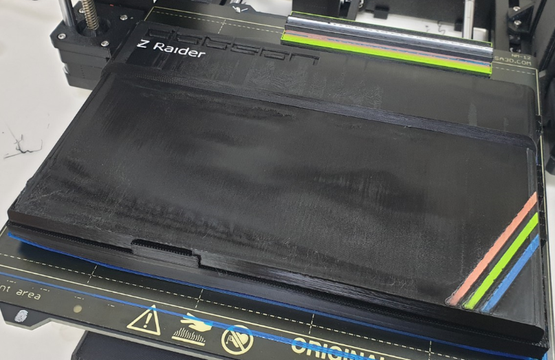
Furthermore, even where the ironing had worked properly I wasn’t too happy with the final result – it looked good in places but just wasn’t anything like as consistent as the finish you get on a bed-side-down print. I did a couple more attempts at this before deciding that a full re-think was going to be needed.
Splitting Up
Having found that a single-piece print was going to be of pretty poor quality and having stared for a long time at my Prusa printer as it chugged away I noticed the way Prusa themselves put a texture on the facia of their printer controller. How do they do this I wondered. Fortunately it’s easy to google stuff like this and it turns out a textured metal plate can be acquired for a Prusa i3 which makes it easy to generate textured prints (on one face).
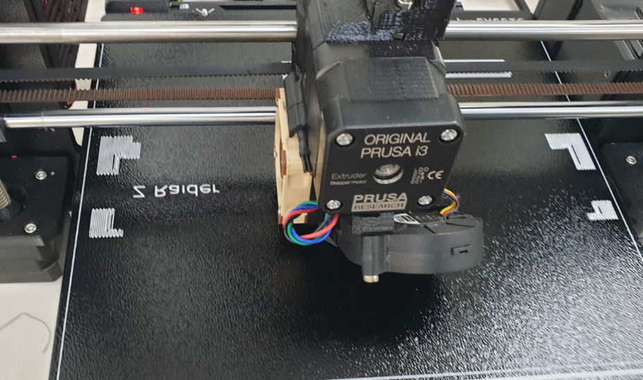
The part arrived after a couple of days and I’d spent quite a bit of the intervening time splitting the model in two – which basically meant starting from scratch again. The two parts would need to be attached together somehow and I wanted to disguise the joining line as much as possible. I solved the first problem by buying some very short self-tapping screws and designing in an extension of the keyboard plate that goes under the high-part and an equivalent plate on the high-part to tap into.
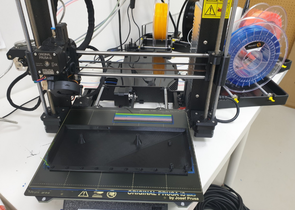
The second challenge was a little more tricky and I eventually decided to follow the raked line of the rear section of the case right down so that the two pieces would join on an angle. This actually turned out to be a good move as I think you will agree in the final version.
Logo and Spectrum Stripes
To create the logo and spectrum stripes on the single-piece case I had decided to forego the four stripes of the original Spectrum case and use 3. The real reason for this is that my Pruse i3 has the MMU2 which can handle 5 colours but not more. The case is black and the Spectrum logo text is white so that only leaves 3 colours for stripes.
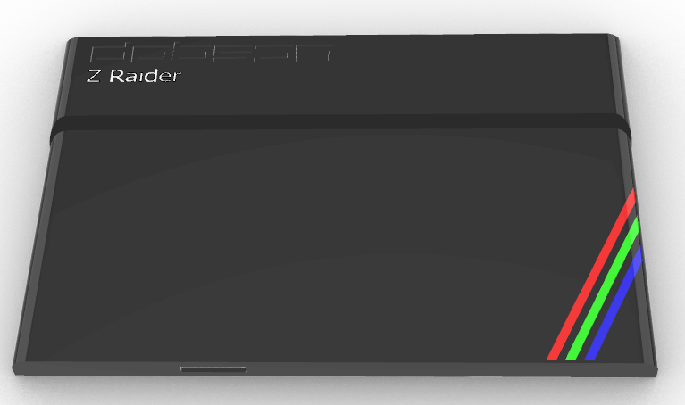
I’ve subsequently realised that when I split the design into two parts I could have reverted to 4 stripes as the white Spectrum logo is not on the keyboard part where the stripes are. Maybe I’ll get around to this sometime.
I found a font which looks a lot like the original font that SINCLAIR used for and created a recessed version of the maker logo – I didn’t try an embossed version as I’ve found they don’t print as well as recessed ones. I used my own name instead of SINCLAIR but I guess it wouldn’t be too tough to change it back – or pick your own name – if you want to create your own.
The ZX Spectrum text was also changed to Z-Raider as that’s the name of my machine. It is created from a standard font with around 3 layers of white plastic in recesses within the black case. The result is flush with the top surface of the case.
The stripes are also a few layers thick but they wrap slightly round the side of the case. I limited the wrap around to only a few mm as each extra layer with the multiple colours involves 5 filament changes and makes the print far longer – and less reliable as I find with my printer there is a non-zero probability that a filament change will fail and stall the print.
The Final Cut
Finally I managed to get two ok prints – one for the rear section using the textured build-plate and one for the keyboard using the standard built plate. Putting them together proved easier than I expected – a little sanding here and there by really they more or less fitted right off the printer.
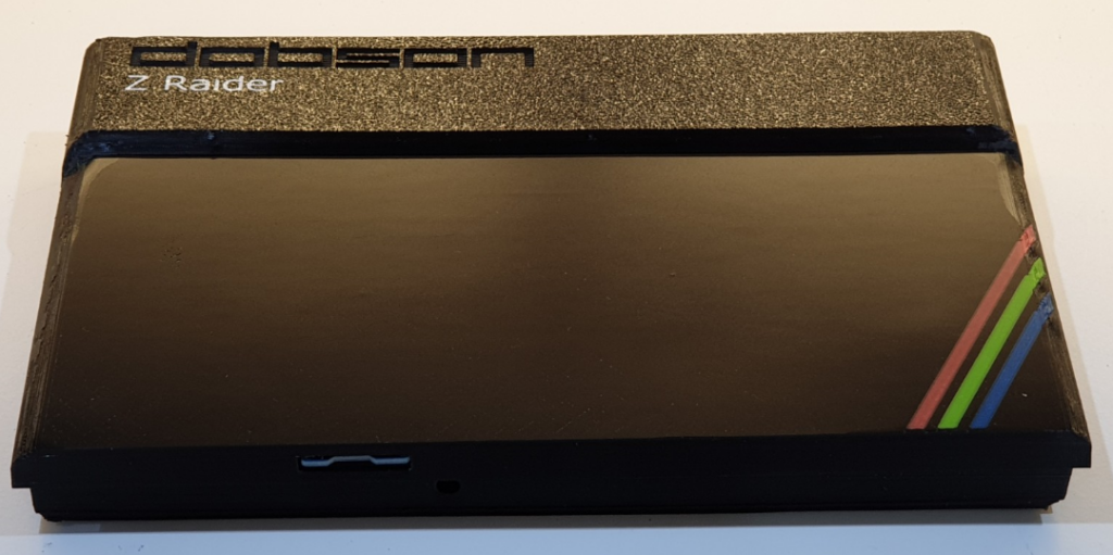
I had a little work to do on the curved sections and I used wet-and-dry sandpaper – starting at around 400 grit and moving to 1500 grit with water to get a better finish. I could probably have done more and maybe I’ll have a go with some plasticote or similar to try to get a nicer sheen.
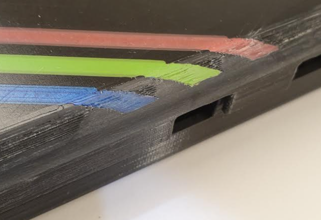
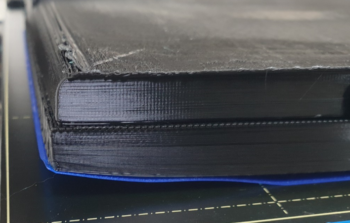
The part I’m least satisfied with is the curve away from the build-plate which forms the curved sides of both the keyboard and rear section. The problem here is that the perimeter of the first layer of this curve clearly doesn’t touch the build-plate and is therefore either unsupported (if printing with no supports) or is supported by a layer which is on the build-plate and is then extremely difficult to remove. Either way it doesn’t look good. You can also see some bed-separation issues in the image above.
Create You Own!
Things you’ll need to create your own case:
- The STL files – or mix your own variant if you like
- A 3D printer with bed size of at least 240mm x 200mm
- A textured build plate such as this one from Amazon
- Multi-material 3D printer or the patience to change the filament manually
- Filament – I used Filamentum Traffic Black along with some colour samples I got – you only need a short length of white, red, green, yellow and blue
Slicing and Support Settings
My best attempt was to print the two top-pieces without automatic support but to create some support enforcers at regular intervals along each curved section. This can be done in Prusa slicer as explained in this video.
It is probably also worth test printing the first few layers and then checking the bed adhesion. I found that it took quite a bit of jogging (Live Z Adjust) of the Z axis to get good first layer adhesion – and from the photos you can see I never did get it quite right.
If you have a multi-material Prusa printer then the procedure for getting the parts together is to load the first one normally and then use the process described in this video to add the stripes and print them all together.
Alternatively you can try changing manually using this technique but it might become a bit tiresome – I think around 40 changes are needed to print the keyboard part!
Fixing it all together
I used an M3 6mm self tapping screw to fix the two parts of the case together.
You will also need some screws to attach the base to the top parts. I used two different sizes of self-tappers in the base – one for the ones which fix the main board in place – which can be quite short – and a different (longer) one to go through the BusRaider and Pi Zero boards. The shorter ones are M3 20mm and the longer ones M3 24mm (I don’t know where these came from – they have flatter ends than regular self-tappers).

